Minimalism in Web design: past and future
Note: This post is over 11 years old. The information may be outdated.
Minimalism is one of the most enduring visual frameworks in Web design given its timeless elegance and clear presentation of content. While cycles of popularity come and go, the design technique is a classic and lasting visual philosophy for designers across all specializations and industries.

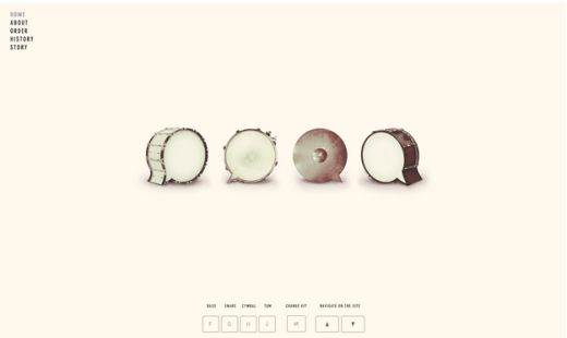
Photo credit: Beatbox
As an artistic style, minimalism is not at all a technique exclusive to Web design. Roots of minimalism movement in design can be traced to the early 1900s as print designer Lucian Bernhard pioneered a simpler design language. Since then, the technique has endured, gliding through time as if perpetually new.
Designers of every era find themselves connected to a minimalist approach of some fashion, including our current minimalism explosion. In this piece, we’ll review the principles of minimalist design, explore its appeal to web designers, then explain how we think the technique will continue to mature.
Less is More: A Brief History & Deconstruction
Those three little words are the simplest definition of minimalism. The spirit of minimal web design is to create an impressive visual website without a lot of bells and whistles.
A minimal design by nature is not stark or barren, although it certainly can be.
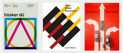
While minimalism originated in the turn of the 20th century, it really came to the forefront of design during the 1940s and 1950s in the form of the Swiss style of design. As you can see below, this restrained style was created through bold colors, crisp sans-serif fonts, and vivid photographs. If you were to further deconstruct the designs, you’d notice that the layout and alignment rely strongly on a grid format (which is now the foundation of most minimalist Web designs).

Photo credit: awwwards
Similar to its graphic design origins, minimalism in Web design is the purest form of sculpture through subtraction – perfection is achieved not when there’s nothing more to add, but when there’s nothing more you can take away. Although current minimalism is centered around negative space and black lettering – the core of minimalism – the style defines itself by achieving the minimum of essentials through any means.

Photo credit: http://paprika.com
Photo credit: http://minerva-is.net

Photo credit: http://fabrik.co.jp
Minimal Web design is built from these fundamentals, all of which are designed to focus on the site content:
- Negative space – Commonly referred to as white space, negative space is simply any unused space in a design. Oftentimes in minimalist design, you’ll see this space filled with vibrant colors (or it could just be left white/grey/black).
- High definition photographs – Since there’s less interface ornamentation, users can better appreciate the stunning detail of HD photography. You’ll usually see these photographs overlaid with ghost buttons (white outlines of buttons) and bold typography.
- Dramatic typography – Whether it’s a script font for the headline and a more straightforward sans-serif for the body copy, typefaces in minimalist design are one of the few areas where visual flourish is acceptable. If you’re curious, check out this excellent collection of 20 minimalist typefaces.
- Striking contrast – Contrast is created through a combination of unlike design elements. For example, a bold white 72-point typeface against a dark image. Or, a light green monochromatic background overlaid with a white script font.
- Simple navigation – The most complex navigation you’ll likely see is a dropdown menu (and even then, you won’t see submenus pop out). More common, you’ll find a top-level horizontal navigation or even a hamburger menu.
- Visual balance – As described in our e-book Web Design for the Human Eye, visual balance is achieved through a clear visual hierarchy, consistent alignment & positioning, and smart use of symmetry and asymmetry.
Now, you might assume minimalism is easy – after all, less elements means less work, right? In fact, the opposite is more accurate: because you are restricted to a few elements, these elements must be crafted with painstaking care and purpose. Poor use of minimalism may be easy, but to use it correctly is not.
Minimal design is intentional. It is an approach that strips the unnecessary elements from a framework to leave only what is required. Most minimal website designs will not include a lot of color (palettes often only have one color aside from neutrals), texture or shapes or accents.
Minimalism works because it does what all design should do – it puts the emphasis on content.
The Appeal of Minimalism
Minimalism prevails because it is an effective and visually dynamic option for designers. Like all lasting design philosophies, it’s experienced multiple evolutions over time and meshes well with a variety of other design languages and design techniques.

Photo credit: http://www.howardyount.com
As we described in the Curated Collection of Design Techniques: Cards & Minimalism, minimalism achieves a number of design goals with an efficiency more complex styles can’t match. This explains why it endures when trendy, flavor-of-the-week styles come and go. The advantages of minimalism in Web design, and the reasons for its popularity, include:
- It’s a natural fit with responsive design frameworks.
- It reduces the information for browsers to process, causing faster site load times and better site performance.
- The concept is content-driven, which coincides impeccably with the rise in content-first design processes.
- It applies to a variety of disciplines beyond Web design, such as architecture, interior design and art.
In minimalist Web design, a common approach is to subtract design elements until the site is on the verge of "breaking". From there, test the website with a minimum of five users, then reprioritize design elements and interface objects as needed. By following this process at least once (we’d recommend for each major design iteration), you’re able to strike a balance between usability and elegance.
The Future of Minimalism in Web Design
Even though the design space is seeing a rise in minimalist sites at the moment, don’t confuse this timeless technique with a mere trend.
Because we have seen it happen in print design areas, it is likely that minimalist Web design will ebb and flow for years to come as well. As with any popular design technique, the initial surge in popularity will likely be followed by a pull-back of sorts, where almost opposing techniques will find popularity, before the technique circles back again.

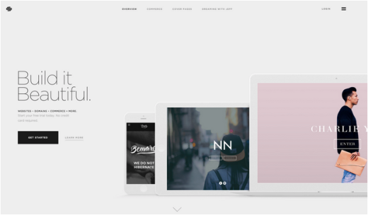
Photo credit: Squarespace
To the end, minimalism will continue to be a popular option, but is likely to evolve into a style that is a little less stark. As we have seen with techniques such as flat design evolving into "almost flat," minimalist design will become richer (and more usable) as UI designers experiment with texture, color and effects – as well as moving away from symmetrical patterns.
Let’s explore a few of these evolving elements below.
1. Minimal texture
Designers will expand from stark background styles to include a more pale or almost unnoticeable texture with a aesthetic plan that is minimal in every other way. This breakaway from a purely minimalist style still has roots in simplicity, but with a little more visual variety.

Photo credit: http://ezorzi.com
2. Reverse colors
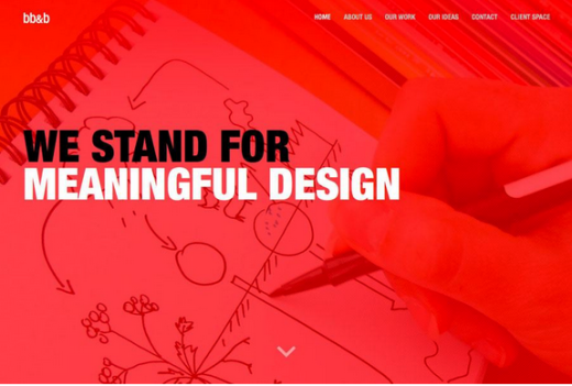
While white backgrounds have been the dominant feature in minimal design (giving a very literal meaning to white space), designs will continue breaking from this pattern by using more color, backgrounds that are dark with lighter text, or a monochromatic color scheme using various shades of the same hue.

Photo credit: http://www.bb-b.net/en/
3. More interactive effects
Of course, minimalism is also traditionally defined by a lack of effects. Simple animation in the minimal style will become more popular as more designers appreciate that minimal does not equal static.

Photo credit: http://oakstreetbootmakers.com
4. Move away from symmetry
The current minimalist landscape favors symmetry, but that is certainly not a law. While balance is important, actual symmetry is not.

Photo credit: http://theafrix.com/work
More websites will actually use asymmetrical concepts to create organization, balance, and a strong minimal aesthetic. As the design landscape becomes more saturated, web designers can apply asymmetry towards common UI patterns to create a familiar yet fresh look.
5. Improved usability
Ironically, minimalist sites should be more usable (in theory) since the content is clear and less distractions exist on the screen. However, you can easily run into the issue of minimal design that’s too minimal.
For example, as Delwin Campbell describes in the above article, using a purely icon-based navigation system may confuse users if your visual metaphors aren’t straightforward. Or, as Tara Hornor suggests in her article for UXBooth, designers may only allow users to explore the site in a linear fashion, restricting the freedom of users to choose their most efficient path.
To swing the pendulum back towards functional aesthetics, we’re starting to see more designers embedding traditional interface elements like clickable elements, scrolling designs, and additional calls to action into minimalist designs.

Photo credit: http://wildflower.resn.co.nz
Conclusion
Minimalism is more than just white space and the fewest elements as possible. The heart of the minimalist philosophy is in emphasizing content. Reducing the elements and featuring a lot of negative space are simply means to that end – they minimize distractions so that users can focus only on what’s important.
Never misinterpret minimalism as the ends in itself, or you’ll just as likely find yourself deleting elements with irreplaceable functionalities. That’s not sculpture through subtraction – that’s just subtraction.
To learn more about minimalist web design, check out our free e-book The Curated Collection of Design Techniques: Cards & Minimalism. The book includes 70 pages of advice explaining how to create card-style and minimalist web designs with 43 examples from Google, Microsoft, Squarespace, and more.
Read Next: New Web trends: immersive interaction design
Image credit:Shutterstock
Article Source:TNW - Minimalism in Web design: past and future
